
Meat Your Maker part 2
Thanks for coming back, dear reader. This is the unveiling of the second part to the "Meat Your Maker": A Field to Factory Triptych. I call this one "RMCBOVINE" was again is short for Red McDonalds Bovine.
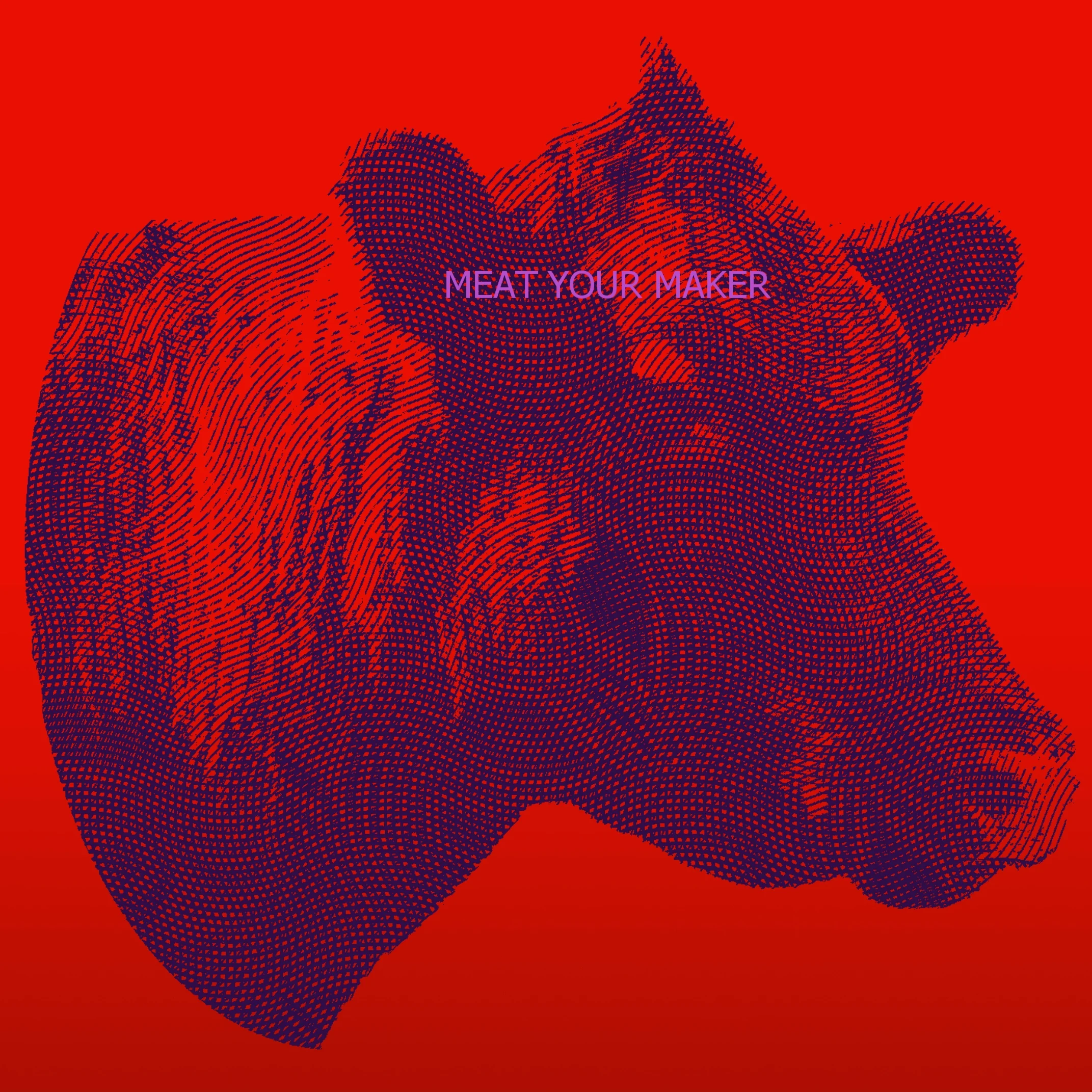
Thanks for coming back, dear reader. This is the unveiling of the second part to the "Meat Your Maker": A Field to Factory Triptych. I call this one "RMCBOVINE" was again is short for Red McDonalds Bovine. I touched up on the color theory of the pieces previously in posts, and I suppose it will be more evident when the third piece comes out later this week. How so ever you can get the theming between pieces just from these two. Red and yellow being primary colors, while orange and this time around purple taking the secondary color spot. The nice people at a neighboring farm from Hillbunker Farms, Windy Acre Farms, let me on to their property to shoot, and was able to nail the shot after only a few minutes with little to no difficulties. The gradient used was more of a black leading to the burger shot. Now I'm not putting McDonalds, a Chicago company, on blast but I'm not foolish enough to not see that McDonalds has been and continues to be the punching bag of an example for anybody and everybody. They are also picture perfect at most any given time as of late, which does helps fish out its poor image the last few decades. Beyond the burger, the style of "urban art" which the burger is made is reminiscent of magazine, newspaper, or billboard ads utilizing a halftone style. Look really close at print ads and still to this day some utilize this style of halftone printing. It gives certain images color tones while saving on ink, and in black and while it can give shades of grey with little effort. Something I always noticed ever since I was little, and shoved my face real close to pictures to see the style of images in magazines and books. That covers this edition of Meat Your Maker, join me later this week as I wrap up this triptych. I'll be putting this and much more later this Summer as Bendersama Photography redesigns the site and fills the shop up a bit more. Until then, take care and thanks for stopping by!

Color Play and Symbolism: A color evaluation of Meat Your Maker
Previously, on my blog....
We discussed how a drummy was destined for something greater than something contrived to more in-line with the flock that was putting out the same unoriginal work day in and day out. I wanted something with more design/color, something to make you think but not hard. Something with a message but not too deep as to seem intellectually edgy and smug. I went with the triptych because I wanted to focus on three sources of meat: "Land Meat" most common of this is cattle with their "transformation" a burger, "Sea Meat" farmed or wild trout and its form being fish sticks, and "Air Meat" Chicken best represented with its counterpart fried chicken. Examples to these may or may not be the best representation of the animal, seeing as McNuggets are far "worse" for you than fried chicken, but I think it's splitting hairs. Anything deep fried in excess can't do a body good, and the fact all three of these "fast food" representatives can be bought as fast food is enough.

The three pieces laid out was supposed to start from the top and degrade to the bottom. This is to show the original full of life animals on top and as the eye moves down the food form of them is at the bottom. Represented for each animal I was leaning on something simple and went with primary colors; Red, Yellow, and Blue. The animals themselves were going to be secondary colors, Orange, Green, and Purple, with the piece next to it; so the cow is going to be maroon or purple (depending) because the red piece is going to be next to the blue piece. The background primary colors are supposed to be vivid and slide down to a darker, depressing, more warped version of the original color; kinda like the animal to their product. The only changes I really swapped up was the fast food items. The original food stuffs were just going to be the same style of black and white "Banksy-like" street art vector, but I needed more diversity in the street art so I went with different mediums; graffiti, wall art vectors, and billboard halftone ad art.
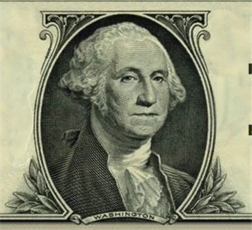
Lastly, the animals were something unique. Back in the ye olde olden days, animals were a form of payment in trade. Barter system aside, the fact is livestock did and still do have financial value. Which got me thinking about the art style of U.S. currency, which always interested me. The line stencil art of each bill seemed very interesting, and I intended to recreate that style with the livestock animals, to give the animals some value. I think that covers the design and color, wanna see the pieces in their final form?
OK!
In two weeks I'll show each one of the triptych every other day! Why two weeks? Because next week I have a video for those interested in buying the triptych. A pre-order bonus if you will.... See you all next week, and thanks for stoping by!